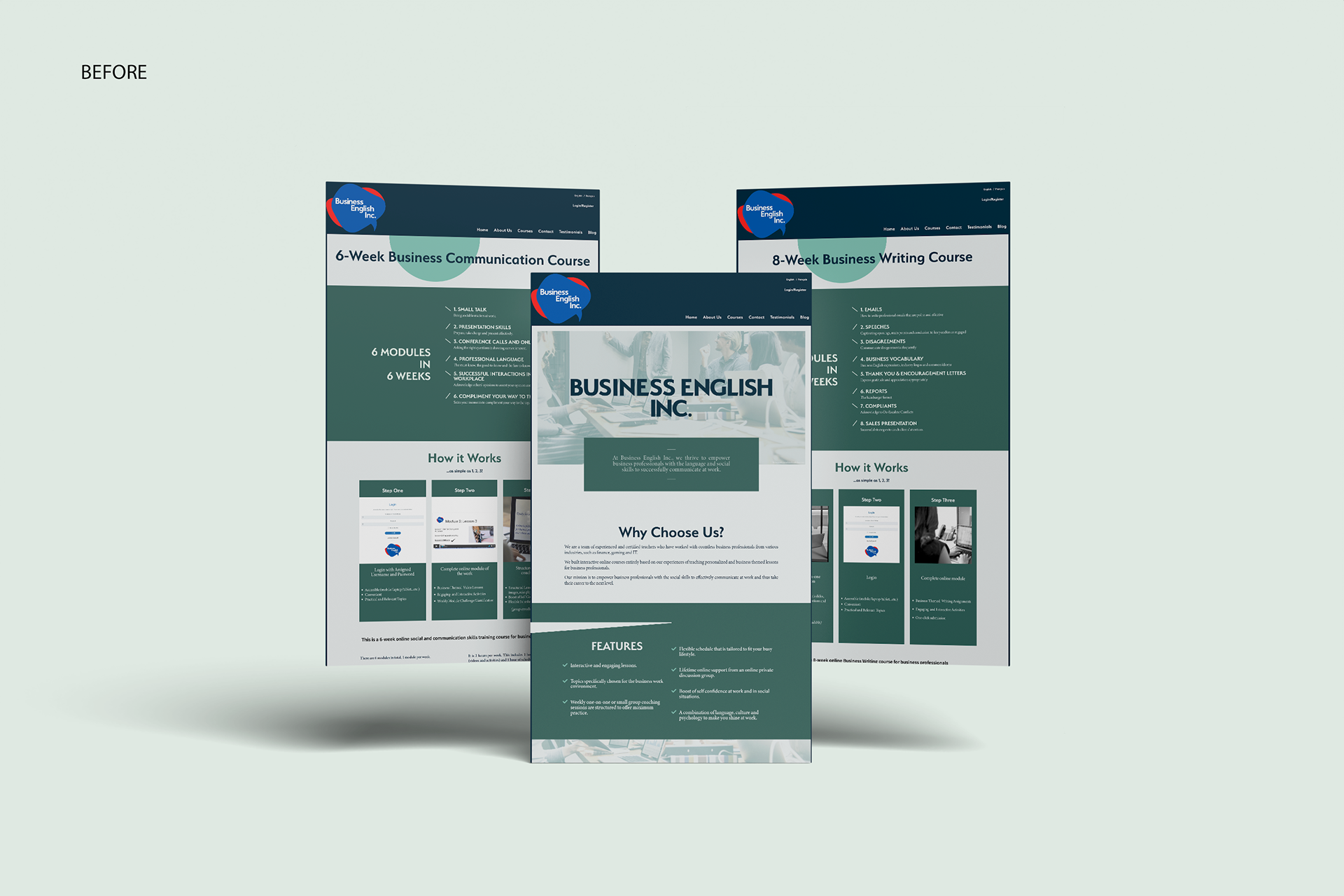
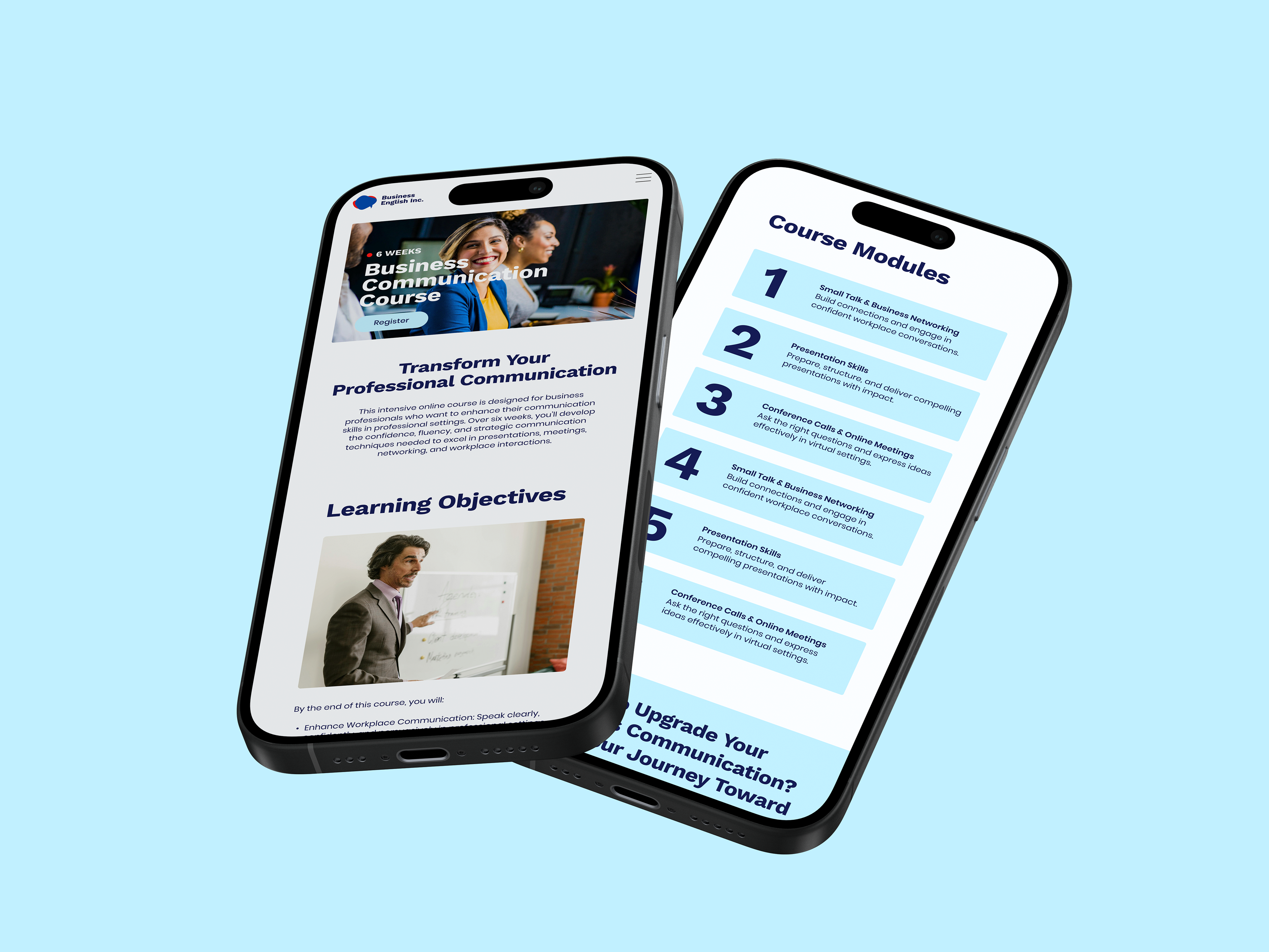
Business English Inc. (BEI) approached me with the goal of enhancing its existing brand and improving its web design to better reflect its new positioning as a provider of personalized quality language training. Their aim was to more effectively attract their target audience, corporations looking to support their employees and business professionals looking to level up their language skills and advance their careers.
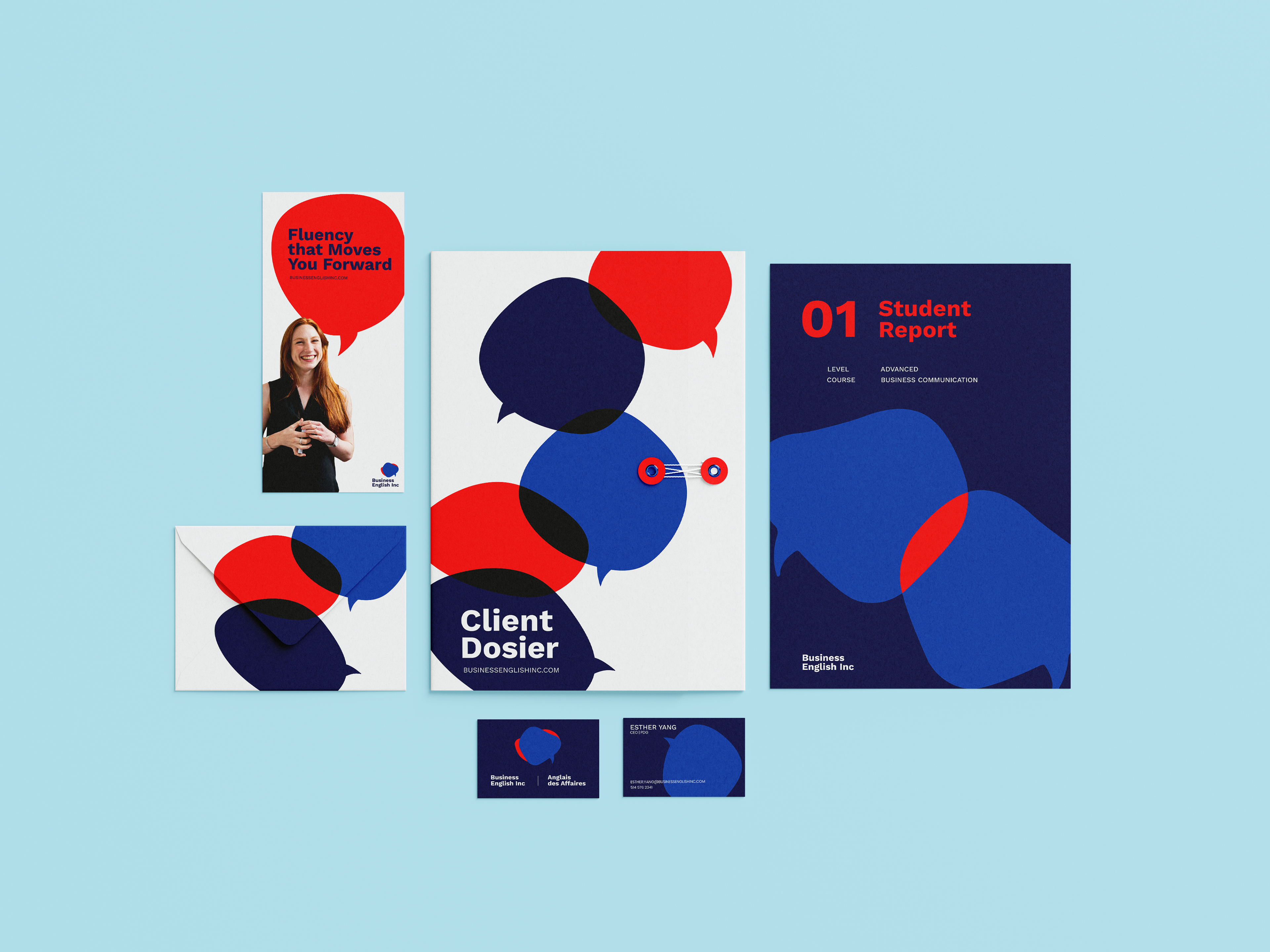
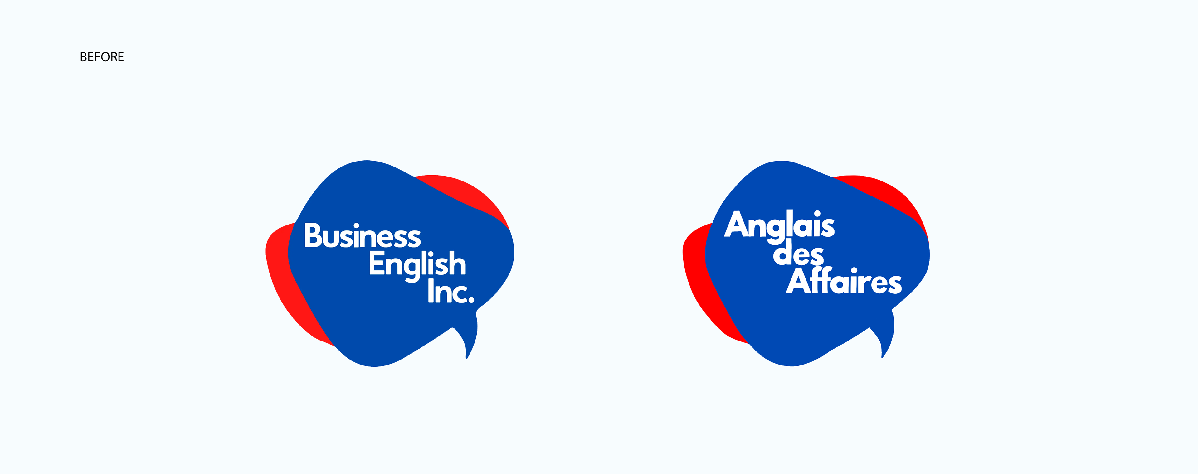
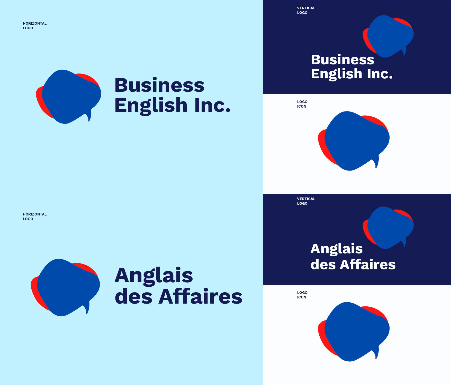
They needed a cohesive brand system that can be independently applied across different touchpoints as well as elevated web designs that better represent them and their audience. However, the essence of the logo itself was to remain unchanged—accounting for only simple enhancements that improve readability without altering the core shape.
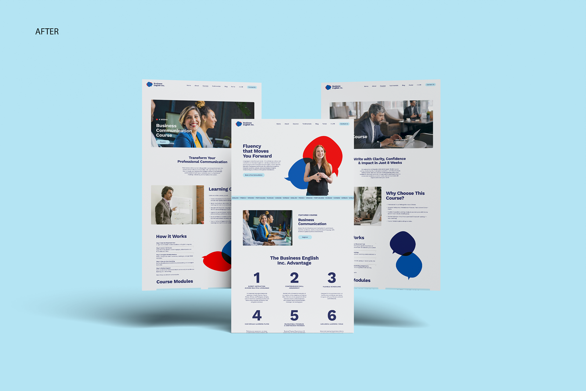
The focus behind the rebrand was to capture the sense of growth and openness that comes from acquiring new opportunities with new skills. This thinking is the basis for the brand’s proposed tagline, “Moving You Forward,” speaking directly to the audience and their ambitions. This, along with the brand values (empowerment, growth, and personalization) was thoughtfully considered in order to position the brand as a reliable language learning destination for business professionals. Visually, the aim was to create designs that evoke confidence, openness, and energy
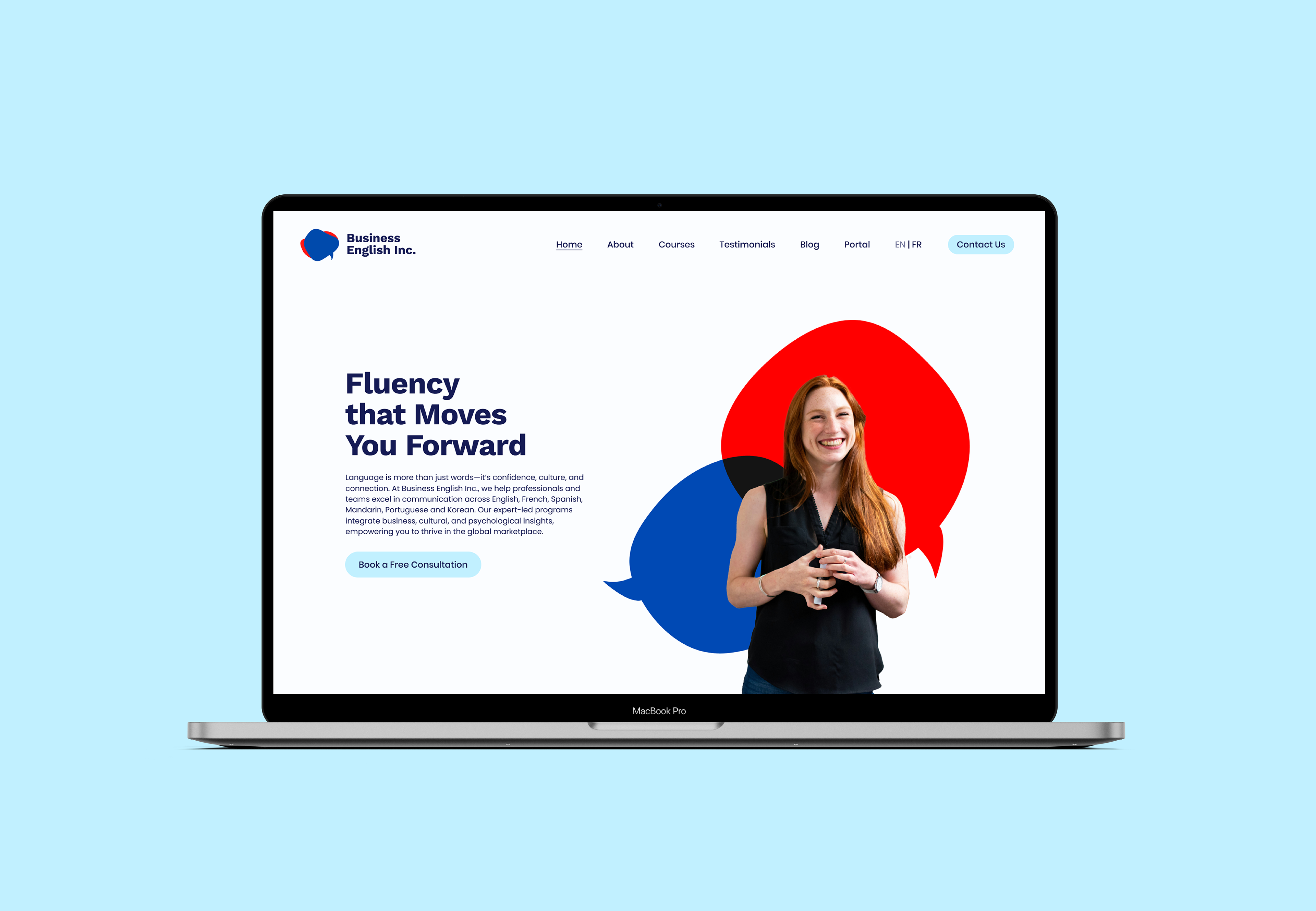
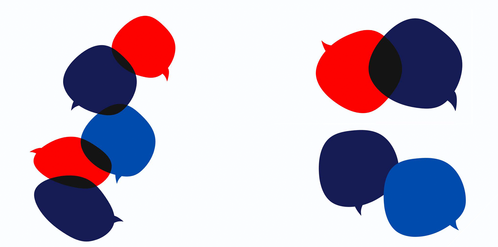
The logo was then transformed to improve legibility, making it flexible and responsive for different applications. The full brand name has been taken outside of the speech bubble frame in horizontal and vertical lockups. The speech bubble can now stand on its own as a brand symbol and logo icon without compromising legibility.
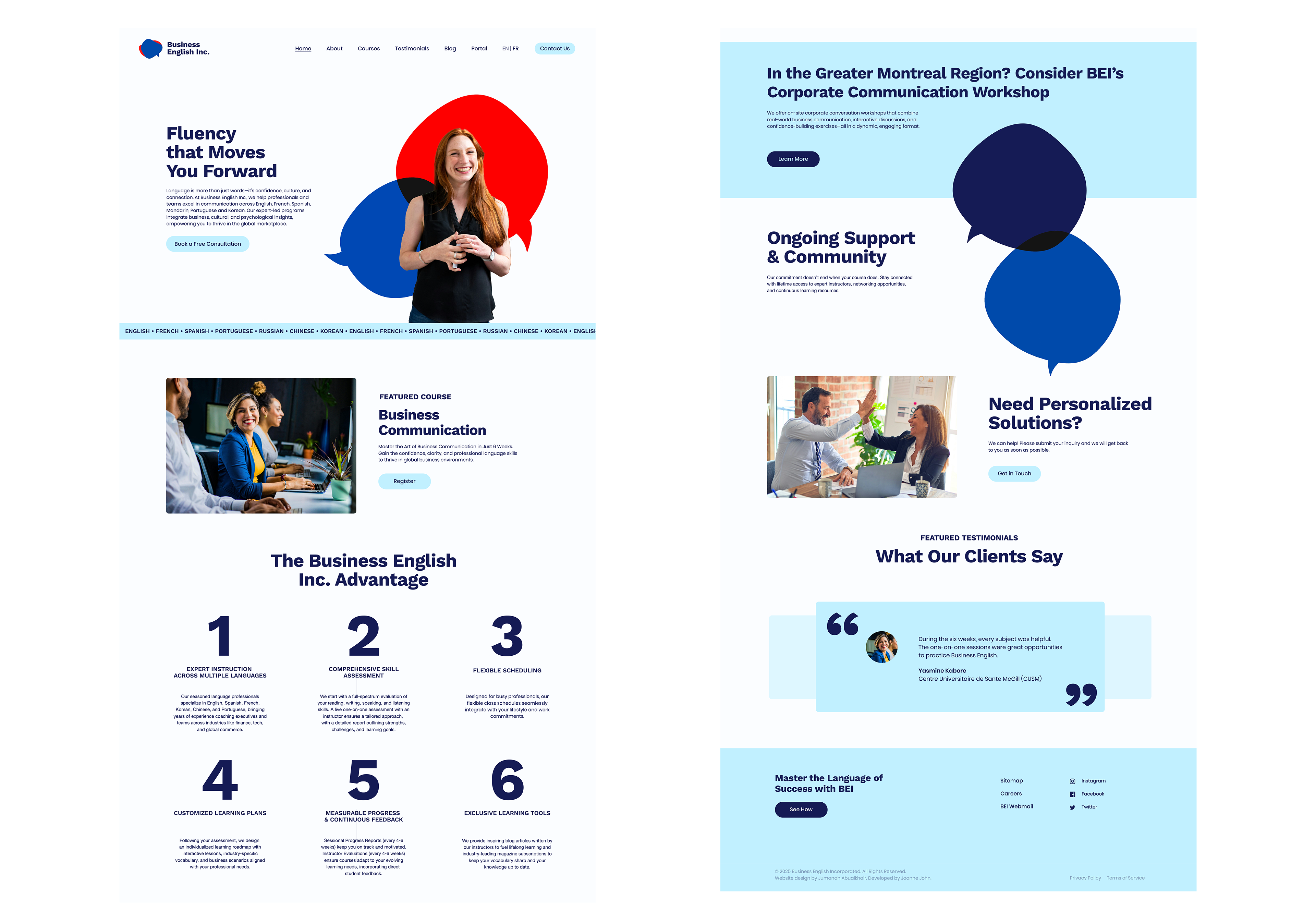
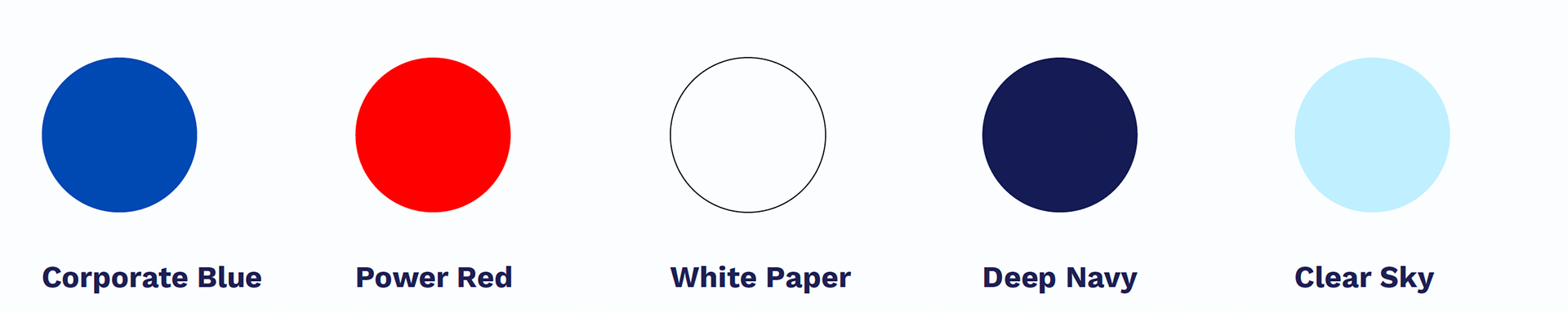
A brand pattern was created to complement the logo and add a dynamic touch to branding. When speech bubbles are layered, a path forms and a sense of movement is created. The colour palette has been modified to feature more contrast, lighter colours for freshness and a darker colour to add trust and ground everything together.